
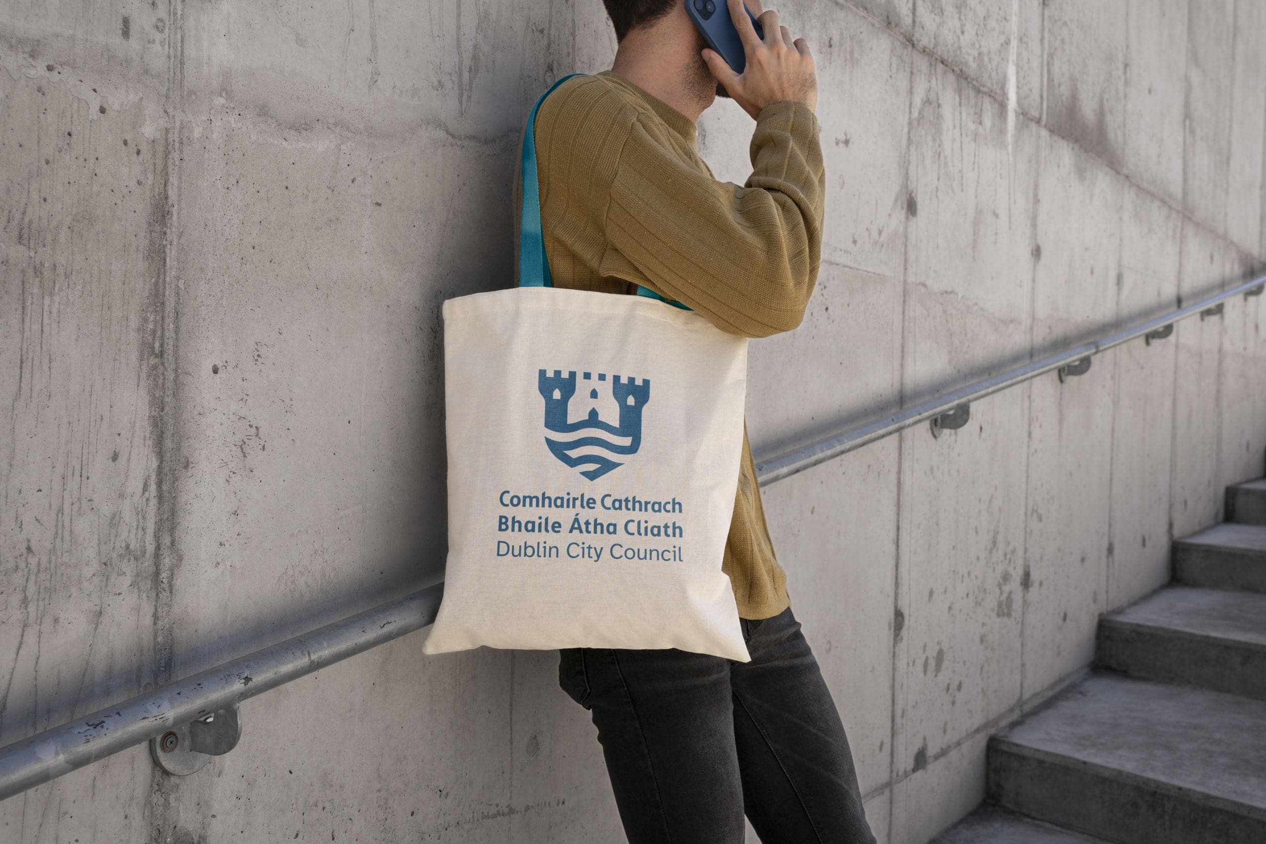

The Brief
In early 2024, Dublin City Council approached us to refresh a brand identity that had been in place for over a decade. While well-established, the legacy branding was struggling to keep pace with modern digital environments and evolving accessibility standards. Working closely with the Council’s internal brand team, we spent 18 months researching, designing, and rigorously testing a new visual identity. The result is a revitalised, future-proof brand that the organisation can proudly champion for years to come.

The updated Logo
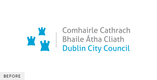
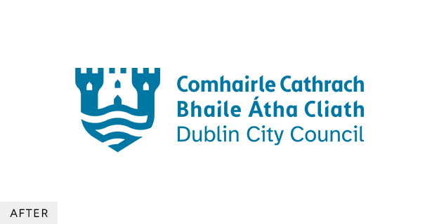
When redesigning the brand mark, we looked to the traditional Dublin City crest for inspiration. To honour the city’s heritage, we retained the three castles—a non-negotiable requirement for the client—but modernised them by cleverly utilising negative space at the top of the shield. To ground the mark in the city’s geography, the lower half incorporates a sweeping wave device that represents the River Liffey, the true lifeblood of Dublin. Designed using the principles of the golden ratio, this revitalised crest strikes a perfect balance between historical significance and striking visual impact.
An Accessible brand
For Dublin City Council, accessibility is a fundamental mandate. We made it the anchor of this brand refresh, ensuring that inclusive design principles shaped every visual asset.
This starts with the core palette. The iconic Dublin City Blue was shifted into a darker tonal space to dramatically improve legibility against white backgrounds. Alongside it, we introduced three new hero colours that each meet the strict WCAG AAA benchmark. Because an organisation of this scale requires immense flexibility, we also developed a comprehensive secondary palette. Rather than leaving application to chance, this extended palette is paired with a bespoke colour decision system—a custom framework that guarantees accessible combinations are used flawlessly across all use cases.
This uncompromising approach to accessibility extends directly to the brand’s typography. Within the logo itself, a bold typeface for the Irish translation is paired with a hyper-legible font for the English text. This thoughtful hierarchy not only ensures full compliance with the Irish Language Act, but also guarantees instant readability for citizens in their preferred language.
For the broader identity, we selected Atkinson Hyperlegible as the new hero font. Created by the Braille Institute of America, this typeface was specifically engineered to aid readers with low vision. Its highly distinctive letters and numbers remove visual ambiguity, ensuring all Council communications are exceptionally clear and universally accessible.

The Full Suite
A refresh of this scale requires more than just new visual assets; it demands a highly functional, scalable system. To future-proof the brand, we delivered an expansive brand suite containing everything the organisation needs to operate seamlessly day-to-day. We built out an extensive library of accessible templates, digital and print assets, social frameworks, and meticulously detailed brand guidelines. By equipping internal teams and agencies with this robust toolkit, we ensured that Dublin City Council can confidently roll out consistent communications across all current and future platforms.


